Windows wow, Macs meh

First day back at work = first time in nearly a fortnight of having to sit and stare at this lump of obstructive machinery perched on my desk in front of me, otherwise known as an Apple Mac Pro 3.1. Mac OS X Version 10.5.8; processor 2.8Ghz Quad-Core Intel Xeon; Memory 4 GB 800 MHz DDR2 FB-DIMM. Apparently.

All kinds of wibble is spoken by either side in the endless Windows vs Mac debate. The Mac camp generally plug for assertions of superior technology, easier troubleshooting, better software …

Let me state my definitive case on this.

I DON’T CARE.

One thing and one thing only am I interested in where computers are concerned: how they arrange their files, and how they let me interface with them. Two things only am I concerned with. How they actually achieve this is of the sublimest indifference. I have stated before that I don’t care if a little goblin climbs up behind the screen every time I press a key and inks in my chosen letter. I consider the possibility my computer is so energy-inefficient that an entire parallel universe might suffer heat death just to supply the power for a game of Minesweeper, and the ennui overpowers me. If it does what I want, when I want it, that’s good enough for me.

I am remarkably consistent in my views, might I add, because I used to think Macs were better – back in the days of DOS and then Windows 3.1. This is hardly a meaningful statement because throwing darts at the keyboard across the room was a better way of interfacing with the computer than Windows 3.1 allowed, but I do want to emphasise the consistency of my philosophy. I’m not grinding a technological axe here, folk.

So here is why, in their current incarnations, Macs fail and Windowses win.

1. The desktop ornament has no hash key. Let me repeat that. The desktop ornament has no hash key. Having repeated, let me rephrase that. The stupid pile of overrated junk lacks one of the most common symbols required for HTML coding. It’s not quite like leaving the letter ‘e’ off the keyboard but it’s pretty similar to leaving out the ‘r’s or ‘n’s.

Yeah, yeah, yeah, I know, you get a # by pressing ALT+3. Hardly intuitive.

2. Minimising applications. I gladly admit that a strength of the Mac is the ability to minimise all open applications with a simply keystroke, specifically F11. Windows could well do with this. However, Macs then go and blow this advantage by having all the applications pop back into view when you select just one of them, missing the point that you actually had a reason for choosing to minimise them all in the first place. I wonder what it could have been?

3. CMD/CTRL + TAB. Related to (2), Macs nicked the Windows shortcut of cycling through minimised applications by pressing CMD+TAB. Except that once again they singularly miss the point of what the user is trying to achieve. The chosen application comes back to the front, i.e. the menu bar in the top left of the screen now relates to that application. But the open window of that application stays resolutely minimised, requiring you to click on it with the mouse anyway, missing the point of a freakin’ keyboard shortcut, you morons.

A Macficionado once tried to explain to me how I could recreate this Windows effect using Spaces – in other words, jump through one extra hoop to get what I can already do in Windows because the system is helpfully designed that way.

4. The inexplicable hang-ups. Even when running a native Mac app, the thing can inexplicably freeze for a few seconds, then remember that it has a fuming user sitting not too far away who is entertaining thoughts of what he could usefully do with a pickaxe, so decide to show a pretty coloured spinning wheel to defuse the situation while it tries to remember what it was doing. Mac software runs more quickly? My nads it does.

5. File selection. Windows and Macs both allow you to choose different icon styles when looking at a folder: small, big, thumbnail etc. But only Windows allows you to select multiple files with a single sweep of the mouse regardless of the icon view.

Let me turn to C.S. Lewis here, possibly for the first time ever in this particular debate. He commented that when he was small he liked lemonade but disliked wine; as an adult, he liked both wine and lemonade. Therefore the growing up has enriched him with an additional experience. He would be impoverished by adulthood if he now liked wine but disliked lemonade, keeping the net total of likes at one.

If Windows lets you do two things, and Macs only one, the superiority or otherwise of the underlying technology is irrelevant. Windows is better. It’s simple maths.

6. Folder listing. Related to 5: Windows and Macs list the contents of folders alphabetically (or by size, or by type etc.) In the alfy view, however, Windows lists first the folders, then the files. Macs list the whole lot in simple alfy order.

It is likely that I might select multiple files to copy/move/whatever. How likely is it that I might select a mixture of files and folders? The answer you’re looking for (hint) is ‘unlikely’. The Windows way of doing it is more helpful.

7. Shortcuts. In Windows, the pop-up menu buttons often have shortcut keys associated with them: rather than click on ‘Save’ or ‘Discard’ you can just hit S or D. On a Mac you have to move the mouse. Again I invoke C.S. Lewis. Windows lets you do more things, more easily, therefore is better.

8. Menu bars. I won’t go into the plusses and minuses of a menu bar that stays in one place as opposed to a menu bar for each open window. I suppose they both have their points. But guess which one I prefer and which one I find prissy and didactic.

So there you have it. A definitive set of arguments that will surely settle this old chestnut once and for all and bring the Applistas defecting over in flocks. Y’know, I might have brought down a mighty empire today. I feel pretty good about that.

New computer

Is black and shiny. Lots of RAM. Is Windows 7. Is not a Mac. All these good.

It’s been nearly 10 years since the last completely new computer, and that was bargain basement stuff that ran on Windows ME and got updated to Windows 2000 as soon as decently possible. For the last four years I’ve been using a secondhand Windows XP PC, which was the bee’s knees when it arrived but since then the bee has grown steadily more arthritic. Upgrading is always at least mildly fraught and in this case it was hanging over me throughout our trip in Sweden, due to the computer arriving the day before we left.

In fact, it’s been possibly the most minimally fraught upgrade yet. Everything important has been installed, a few little-used programs remaining to be added when and as. Documents, photos and music backups all just fell into place (even if I did have to reinstate the playlists manually in iTunes, as it couldn’t read the library file “because it was created by an earlier version of iTunes”. Well of course it was, you fool; you’re the one asking me to upgrade by a decimal point every couple of weeks …). Unlike the old machine, the new (22″) screen can display a double page spread in InDesign CS4 of the Delightfully Dotty Car Club magazine that I design and edit, with fully legible text rather than grey blurs. I looked at the spread and felt that warm glow within that says there may be trouble ahead but it’s dealable with; the worst is over. That was the primary objective: everything else is gravy.

I like the design of the interface. Of course, “pretty” <> necessarily “more functional” – the TARDIS console can’t really travel in time, you know – and the computer would work equally well if the tops of the windows were solid and opaque so you can’t see the desktop behind them, and if the close and minimise buttons didn’t glow slightly as if lit from within – but it ties in well with what the machine actually does. For the first time ever I am forced to use the words “nice piece of design” in the context of Windows.

This is Windows, though, so obviously it can’t do everything perfectly. It finds new ways to insist on being helpful: like when you call up Task Manager to kill a frozen programme (it still happens), it tries to diagnose the fault after you have told it you just want it to drop the programme where it is and walk away. It also keeps asking permission to install stuff, or rather, to make changes to the hard disk. Oh, come on! When did you ever ask that before? And when did I ever say no?

I’ve had to say goodbye to some old friends which are no longer compatible on a 64-bit system. My Windows Cardfile address book, which has been with me ever since Windows 3.1, couldn’t hack the new oxygen-rich atmosphere and so perished. All the data was backed up and has been copied into Google Mail contacts, but even so. The principle. And some long cherished games have gone the way of all things, but I hadn’t actually played any for a long time. They were just junk on the mantlepiece, tedious stuff that you have to move and dust around and never use but you don’t throw them out because they’re there.

I have previously ranted about Office 2007, and just because Office 2010 is three years older, don’t think that changes anything. However, after careful consideration it didn’t really seem uninstalling it just so I could install my comfortable familiar copy of Word 2000 (which came with the ME machine, if I remember correctly). Into every life a little clunky software must fall.

Further fraughtnesses arose in finding that I hadn’t put the installation disc for the old Actiontec wireless router with all the other disks, and anyway the router was’t compatible due to its desire to connect to the main computer by USB. The new router from Virgin (also shiny, also black) has two aerials and WPA2 encryption and four ethernet ports: in fact everything is done by ethernet rather than trying to be clever with USB ports. All of these are good things too. During the installation process, run off an .exe file rather than an .html file as advised in the documentation, I only had to guess (not being told) that I had to turn the modem off and on again twice.

Round about now someone always starts trying to extol the virtues of Macs or Linux because “they just work” or “they’re modern technology” or some other equally vapid reason. What these people never get – are incapable of getting – is I don’t care how it works. I don’t care if a little goblin climbs up behind the screen every time I press a key and inks in my chosen letter (in reverse writing, obviously) on the glass while another follows behind it colouring in the pictures. And I don’t care if this process is inevitably fatal, like a bee stinging, so that having performed this task the goblin then falls to its death and is blown away by the internal fan. It does what I want, when I want it.

So, looking forward to what 2020 might bring …

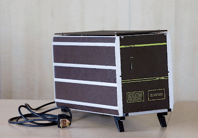
Back when pad didn’t even mean “pad” …


What do you mean, what is it?

It’s a JNT PAD. It says so on the front, in a font that looks suspiciously like Comic Sans, only that didn’t exist back when this baby was made.

JNT = the Joint Network Team, the group set up to research and ultimately implement a UK-wide computer network for research and education, which lives today as JANET. PAD = Packet Assembler / Disassembler – a device used to connect circuit-based computer terminals to a packet-switching network such as … oh, I dunno … the Internet.

In other words, this little gadget – well, I say little, it measures 21 x 27 x 46 cm – was quite important in the history of networking.

It could presumably connect 16 terminals to a network, judging by the connections on the back – plus, which makes it so sweet, in the top left corner, a socket for connecting a cassette facility. Bless! That was the point at which I actually wanted to hug it.

The JNT sponsored its development in 1980 and placed an initial market-glutting order of 50 with Camtec. A further impetuous (gasp) 85 were ordered in 1981. The mad, mad fools! It’ll never catch on.

Photos taken by friend and colleague Sue, who is available at reasonable costs for any respectable function requiring skilled photography.